In-person Treatment Calculator

Simplifying Orthodontia sales consultations by informing patients to increase conversion.

Fry Treatment Fee Calculator
Fry Treatment in-person sales tool

Overview

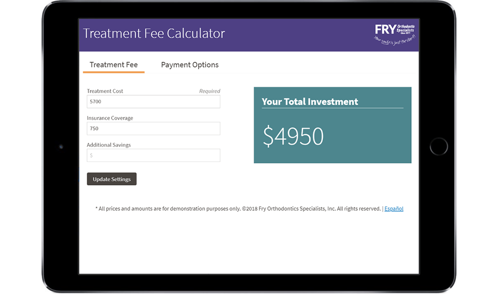
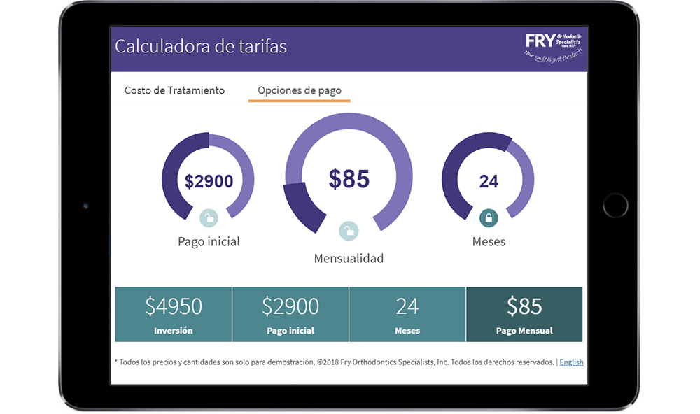
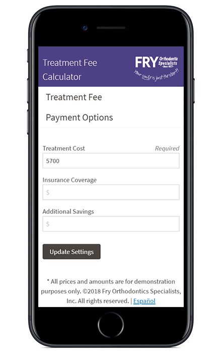
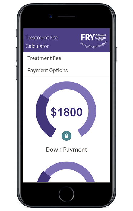
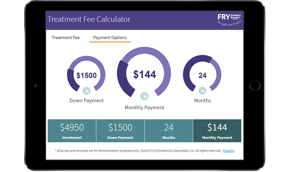
The Orthodontics Fee Calculator is a digital tool that effectively makes prospective patients comfortable with making a large financial investment in their teeth. The Fee Calculator’s primary function is to help guide prospects thru in-person consultations utilizing a tablet during the main sales process.

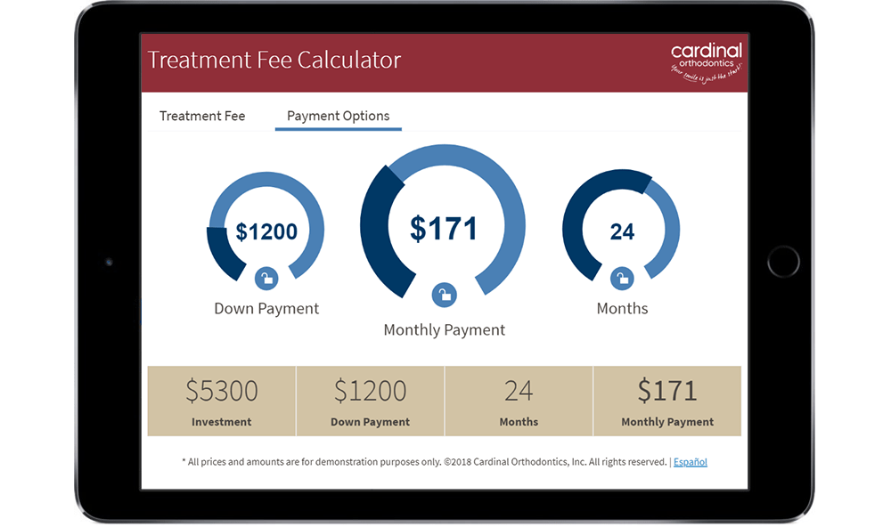
The initiative called for in investment in a multi-lingual and cross-francise solution, delivered in a portable solution with the need for an backend codebase or delivery system. Branding for 3 different Orthodontics practices in multiple cities had to be taken into consideration as well.

  • Date

    January 2018

  • Client Name

    Fry Orthodontics

See Application

Problem Statement

The sales cycle for Orthodontics is very short, and turning prospects into patients can be extremely difficult. The initial sticker shock of Orthodontic treatment is a difficult realization for any prospective patient, and understanding their payment options is critical to closing a sale. In-person consultations become confusing for prospects, and they oftentimes leave feeling overwhelmed.

Unfortunately, expert sales associates are not always available for consultation visits, missing opportunities to explain the numerous ways to finance treatment. Prospective patients are apprehensive and cannot fully envision the multiple financial options available to them to make payments. Lastly, they usually make a purchasing decision within the initial 1 hour consultation visit, so ensuring they are informed and confortable making the investment in their teeth requires additional sales tools.

Timeline

Understanding how reducing cognative load reduces apprehension and converts prospects to patients.

01

Defining the Problem

While observing the in-person consultation process, I asked follow-up questions of prospects to understand the apprehension of making such a large purchase.

02

Research

Identifying the digital tools used by direct competitors and similar tools in other industries allowed for the development of a Design Hypothesis.

03

Hypothesis

Major purchasing decisions require discovery and analysis tools to compare and better understand financing options.

04

Prototype Development

In order to lower preconceived ideas from both horizontal and vertical sliders and apprehension to increase values associated with negative outcomes, a new dial control was built.

05

Usability Testing

Multiple rounds of Usability Testing with existing patients and prospects confirmed the hypothesis that Users performed more exploration with the dials compared to traditional sliders.

06

SPA Development

The mobile-first web application was economically built using React, JSON data, and utilizes a customized version of an Open Source design system to ensure conhesive look and feel.

07

Multi-lingual

To service a larger portion of the community, additional development and customization was performed to allow for dynamically changing content from English to Spanish

08

Customized Versions

To allow for franchise customization of the calculator, the look and feel is easily updated within a JSON configuration file, allowing non-developers to make updates.

Cerner.com Directional Menu System
Initial data entry screen
Cerner.com Directional Menu System selection
Spanish version of Fee Calculator
Cerner.com Structured Template with video media and CTA
Cardinal Orthodontics version
Cerner.com Structured Template with video media and CTA
Cardinal Orthodontics version
Cerner.com Directional Menu System
Phone version initial data entry
Cerner.com Directional Menu System
Phone version calculator with dials
Cerner.com Directional Menu System
Phone version data displays

Results

The UX research performed to unconver a bias from controls related to "increasing costs", allowed for alternative components and UX patterns to be explored. Not only does the dial component remove negative associations, but during Usability Testing, it was reported to be "more fun to use" than a standard slider. While this was not an initial priority, the discovery set the User at ease, allowing for an increase in knowledge transfer.

The Fee Calculator is designed to allow the prospect to adjust a number of different variables, utilizing touch-friendly dials that update the cost breakdown in real-time. This real-time feedback was also attributed to the increased amount of exploration and gain in trust from the Users. The same sentiment has been expressed by actual prospects while using the new tool in the field, as reported by sales staff.

By providing the prospect with a digital tool that allows them to find the right combination of payment options that is right for them, they are more confident in their decision to make the investment. The client has reported an increase of ~25% sales conversion based on the usage over time of the Fee Calculator sales tool.

  • Metric

    25% increase in sales conversion

  • Metric

    Highly educated Prospects

  • Metric

    Happy Client!

Learnings

Traditional financial tools, while reliable, don't always align with Usability, learning, and sales conversion. Also, implementing the most obvious solution to a problem, doesn't always solve your User's actual problem.

Contributions

  • Client Relationship Management
  • Stakeholder Interviews
  • Patient/Prospect Overservation
  • Competitive & Comparative Analysis
  • UX Strategy & Research
  • Wireframing & Interaction Design
  • UI Design & Mockups
  • Prototype Development
  • Usability Testing
  • Frontend Development
  • Continous updates delivery
  • Analytics & Analysis