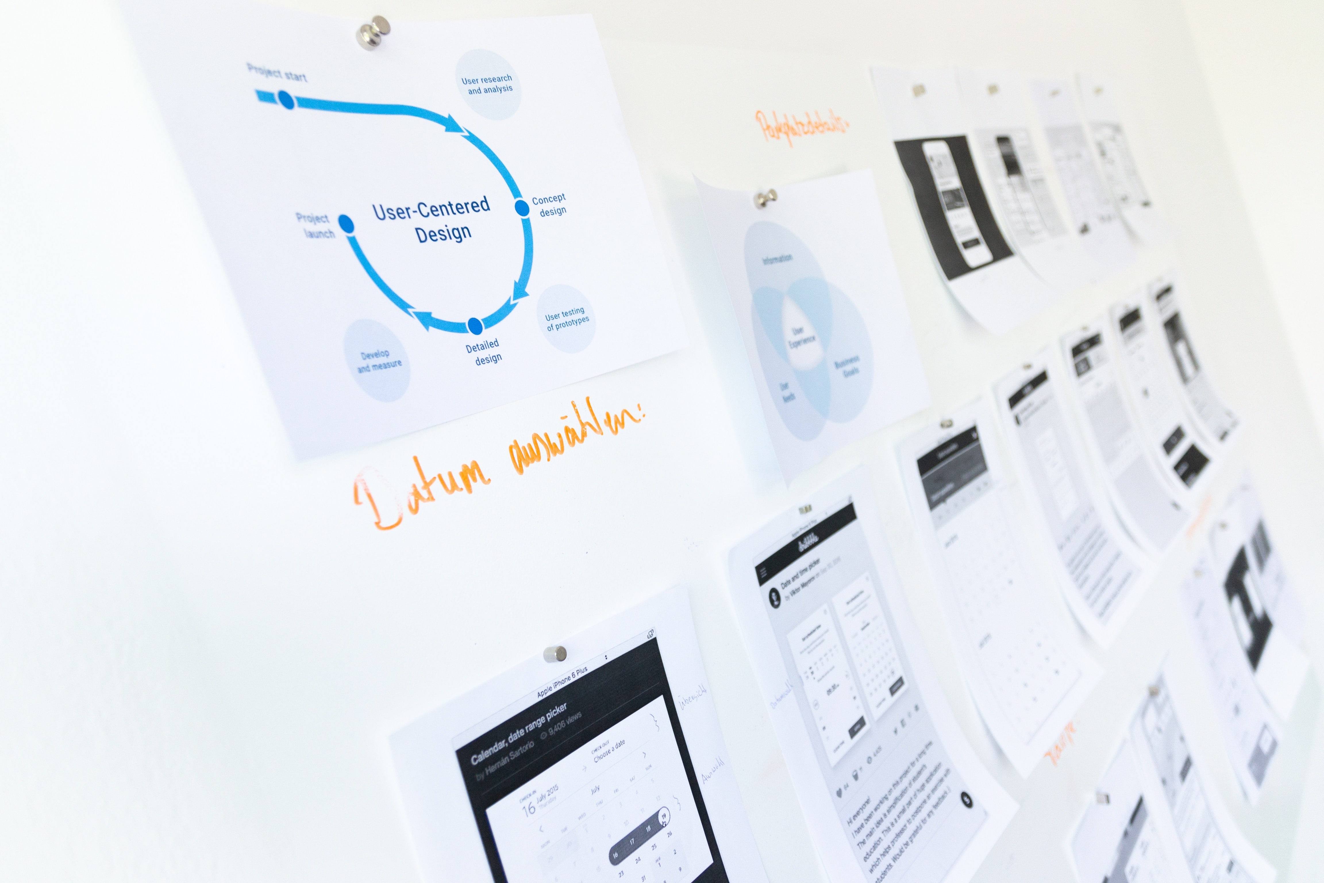
We all have a process. Each of us, as professionals in the digital space, utilize procedures and techniques that have made us successful. To get the job done as a User Experience Architect, there are stages in a design process, based on industry standards, that have given us the ability to determine if an application or feature is Discoverable, Findable, Understandable, or Usable. These are the key principles of User Experience, and how projects can define, deliver, and measure success.
But what happens when you come across a new process that changes the way you approach design problems and speeds up your productivity as well? Utilizing Design Systems allow product development teams to do just that. While style guides for digital experiences have been around for decades, they quickly become dated because they can't evolve. There is no baked-in feedback loop to a document you can print or file away in an obscure network drive. A Design System is a combination of a tool and methodology, that allows for cohesive digital experiences. It is a product that serves other digital products.
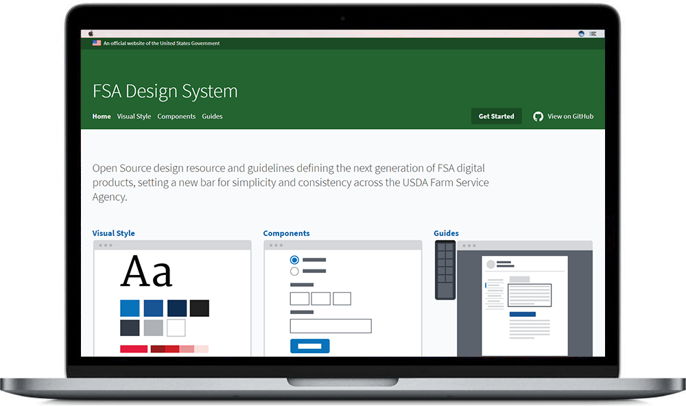
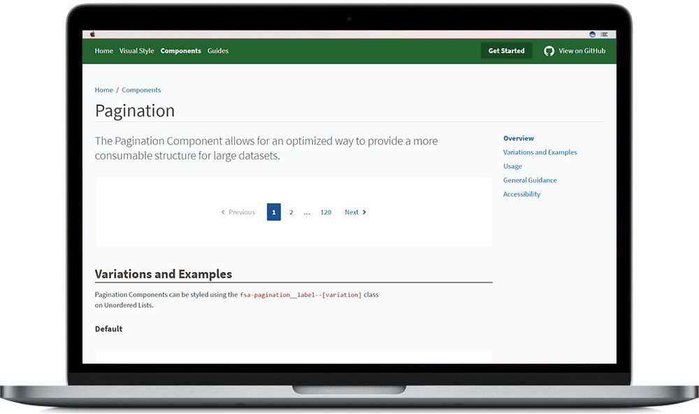
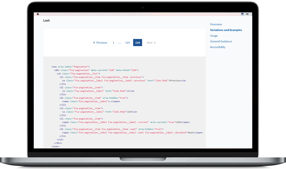
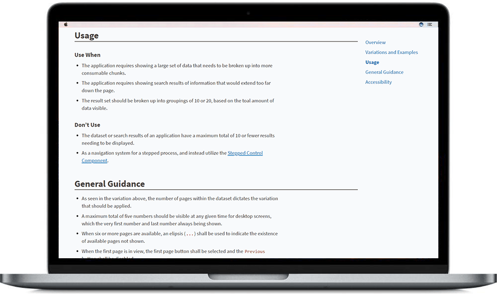
At the USDA, part of my role as a Senior Principal Enterprise UX Architect is to help build, test, and evangelize the FSA Design System (Updated: now FPAC Design System), whose purpose is to bring cohesion and consistency to over 250 applications designed and developed by federal employees.
$1 Million for Buttons
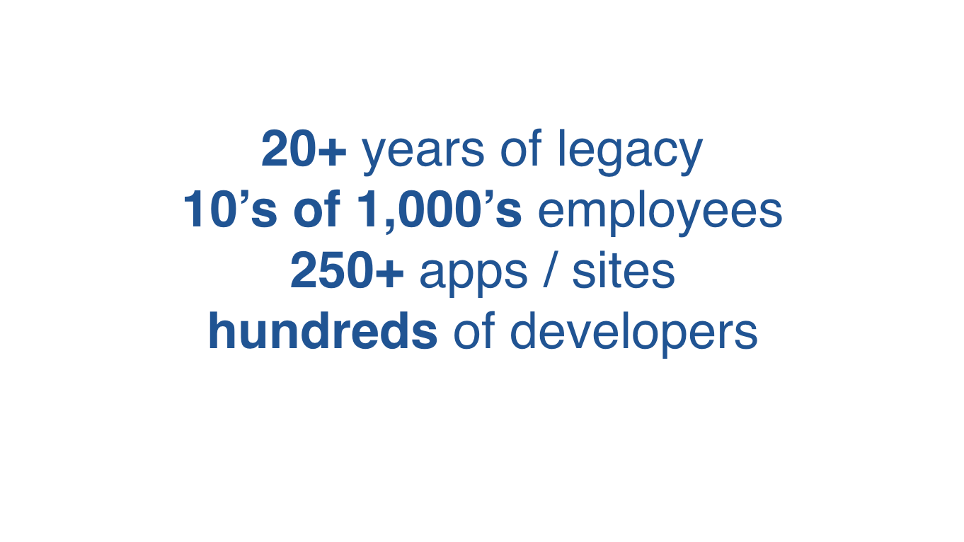
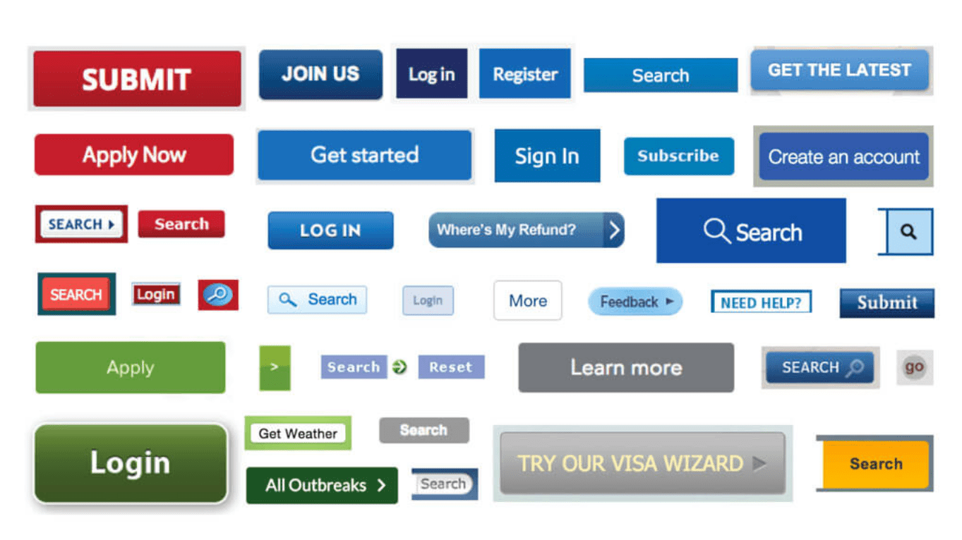
We presented to various groups within the USDA, and I started each presentation explaining a very common situation for organizations that have a large number of development teams. By first identifying a problem, and sharing it with executive-level stakeholders, we were able to gain buy-in from the top. Organizations spend millions of dollars often reinventing the wheel, or button in this case, and a Design System helps to eliminate this failed practice.
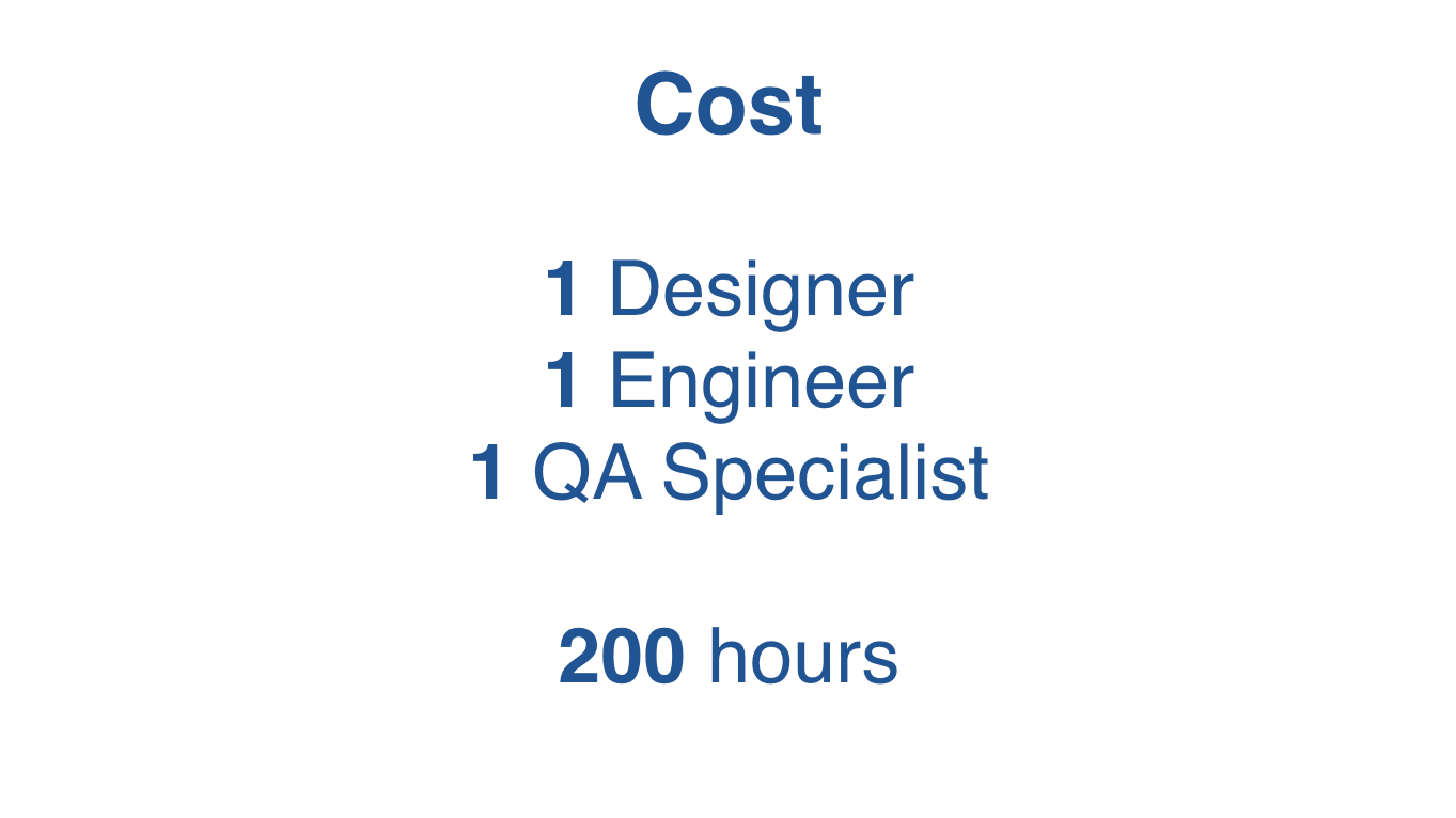
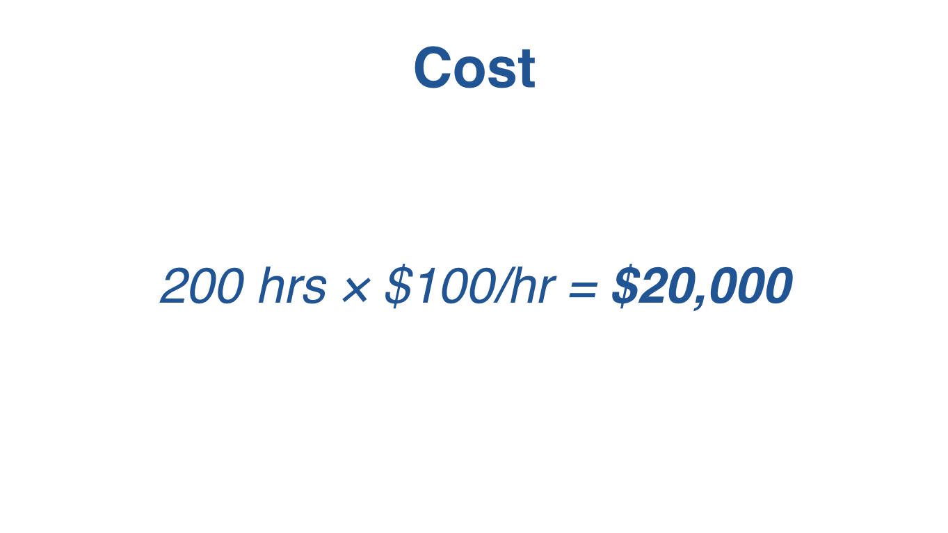
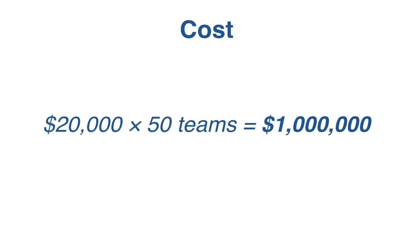
Below are slides from the presentation that illustrated the impact of many development teams all producing buttons which creates a library of inconsistent buttons, and costs the organization millions of dollars. The presentation walks the audience thru "what it would look like" to build all of the buttons for a single application, and the cost associated with this process. We then extrapolate the button example across an entire enterprise of teams and products, and immediately see the problem at scale.
Evolving Your Design Process
As part of the discovery and evangelism stages of the FSA Design System, I facilitated and led the Digital Usability Team, consisting of around 25 senior stakeholders within multiple organizations of the USDA. We met weekly, shared ideas, and held discussions which helped inform the development of numerous prototypes in an effort to build a Minimum Viable Product (MVP) of a Design System. The group included various members of development teams, products owners, and county office Users as well. The process was exploratory in nature, and generally ran like a focus group that tested features, components, and process flow.
When I started, I first utilized Axure with a combination of static Wireframes and interactive Wireframes. As many UX Architects know and understand, Wireframing is a process that helps flesh out ideas prior to developers spending hundreds of hours coding a working application. The main flaw of Wireframes is their inability to gain understanding and consensus across stakeholders. Very few individuals outside of the UX industry know how to use and interpret them, especially product owners and clients. I like to compare Wireframes to football plays or pages of music notes. Unless you are a coach or a musician, it is very hard to understand what is going on.

But what if you could watch the football plan being run at a practice, or listen to the piano play the music? You would have much better understanding about what to expect in the stadium or at the opera house. This is where high fidelity experiences are warranted, and interactive prototypes come into play. We are visual learners as humans, and to see what something looks like and experience the interactions, we quickly find a path to understanding.
As I was working with the Digital Usability Team, I noticed resistance each week from a number of individuals. While Axure prototypes were mostly understandable to the developers and Business Analysts, the business representatives and End Users generally had a hard time following along, and I decided pivot my process. With the Design System being far enough along, I decided to start using it as a means to quickly prototype various concepts. What happened immediately was a better understanding of the concepts and process flow for the end User, because the audience could "hear the music" or "watch the play unfold".
Even in its infancy, the FSA Design System was being strategically used in the same way development teams would eventually build their own projects and progam applications. I very quickly was able to create high fidelity prototypes, that retained the same look and feel across all features at a speed traditionally unattainable with normal UX tools. Wireframes were indecipherable, and design comps lacked movement and process flow. The new process became an exercise of Whiteboard sessions mockups of new features, followed by prototypes utilizing the Design System itself.
So, what is a Design System?
When you combine an ever-evolving codebase with documentation that provides examples and guidelines on how to effectively build your application, you have a Design System. This might sound a bit abstract and since we as humans are visual learners, I believe it is best explained by using an analogy with imagery. The goal of any architectural project is to build "something". To help with this understanding, we can focus on the process of building the below LEGO truck. The below adapted analogy and imagery credit goes to "Multiscreen UX Design" by Wolfram Nagel and "The Atomic Workflow" by Brad Frost.
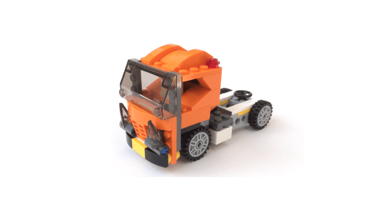
As kids, we began with a large pile of hundreds of mismatched LEGOs. It was very difficult to find more than one or two pieces that had the same shape, size, color, or function. It was always a mess. As architects, we need to be smarter about how we play with our toys, and so we decide to first build a Design System before we start building anything else.
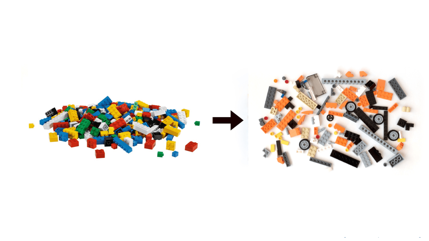
Once we have started to organize the LEGOs and have identified a color palette, we can see how a theme is developing. One of the main issues within large organizations is having many digital experiences and keeping them all on brand.
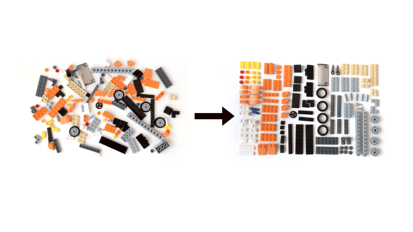
By creating an organizational system that logically places the parts and pieces in an arrangement based on size, shape, and function, anyone can now utilize this Design System to quickly build our LEGO truck.
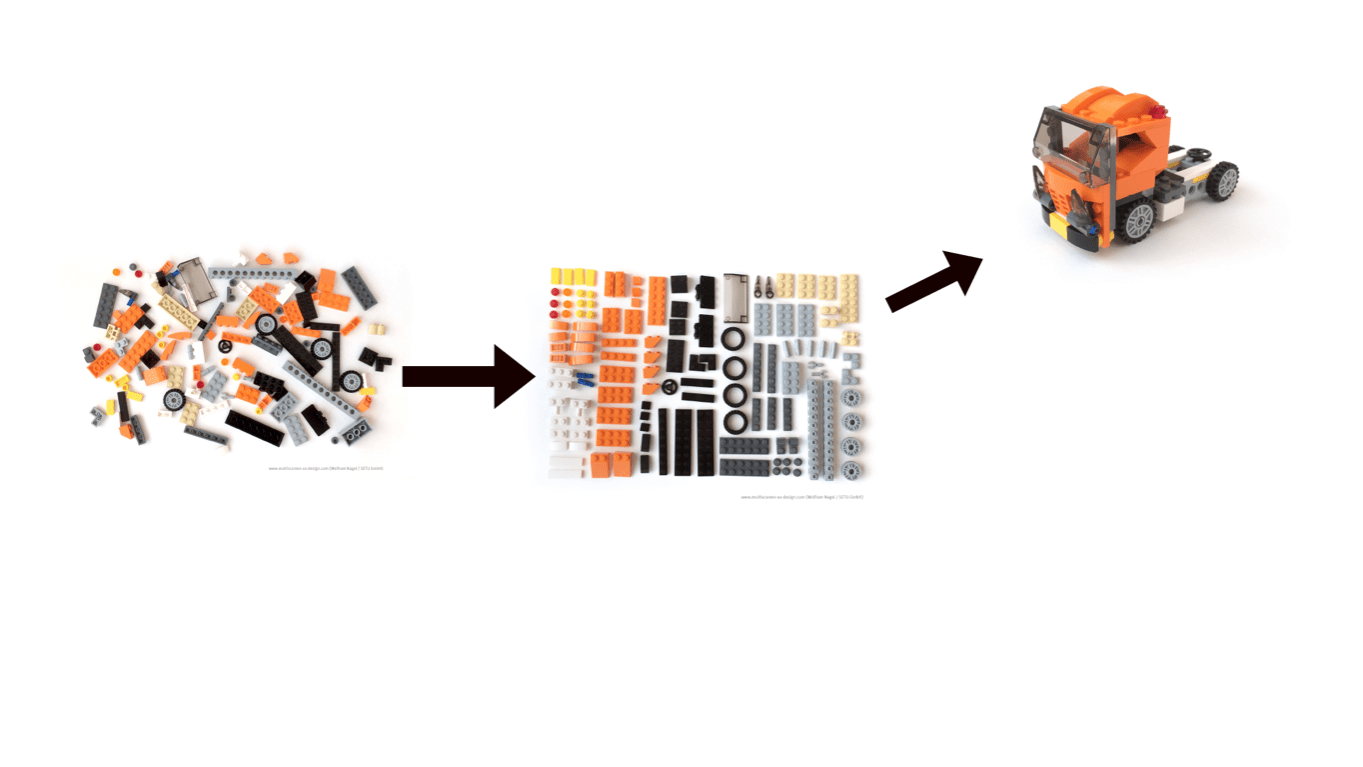
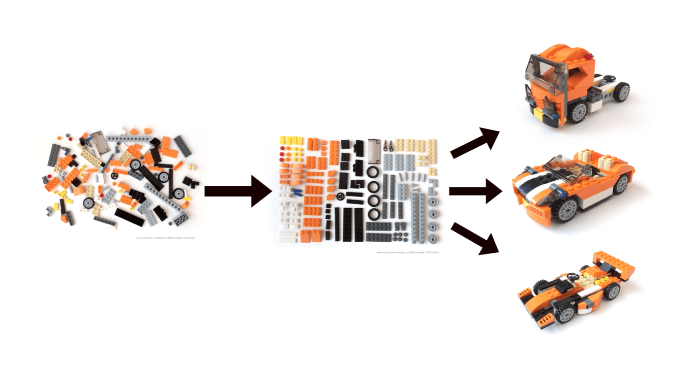
Because of the speed and efficiency that is gained thru utilizing a Design System, different LEGO vehicles can be build that are cohesive, consistent, and operate in very similar ways. We developed a methodology that optimizes a automated build process, solves for Accessibility issues (Section 508 Compliance), and alleviates the need to make design decisions that could potentially cause a poor User Experience.
Products Giving Back
Following the User-Centered Design process, we can consider new components or UX patterns to include in future iterations. For example, lets assume our new product requires a Contact Us form, and the Design System has a number of different form fields. We build out our application but discover the application requires Toggle capabilities, which doesn't currently exist within our Design System. A new toggle component can be built for the profram application, utilizing the similar markup and style. If the UX Architecture team believes the enterprise would benefit from this new component, we can integrate it into the next version release of the Design System. Both old and new products can update their codebase via NPM or other methodologies, and easily take advantage of the latest components and features.
Final Thoughts
Building a Design System to create cohesive and consistent User Experiences will require more effort initially to build the foundation, but once an MVP is available, product teams can begin to see the benefits. As the codebase is built out, the accompanying documentation informs development teams of best practices, usage, and accessibility concerns.
Working with Design Systems has changed my way of thinking, and the way I approach a design challenge. Not all organizations have the ability to build their own Design Systems, but there are a number of Open Source ones available for adaptation and integration, including the FSA Design System itself. I highly recommend looking into ways to incorporate the same methodology and process if you are looking to speed up product development and create consistent and cohesive digital experiences.
Good Luck!
